Great packaging design doesn't just look good — it sells products. Whether you're designing for retail shelves or e-commerce deliveries, the principles are the same: attract attention, communicate value, and create desire.
Here are the design principles and practical tips that professional packaging designers use — adapted for business owners and marketers.
Start with Your Customer, Not Your Product
The biggest mistake brands make is designing packaging they personally like, rather than packaging their customers will respond to. Before opening any design software, answer these questions:
- Who is your target customer? (age, gender, lifestyle, values)
- Where will they encounter your packaging? (shelf, doorstep, social media)
- What emotion should your packaging evoke? (luxury, fun, trust, sustainability)
- What are your competitors' packages like — and how can you differentiate?
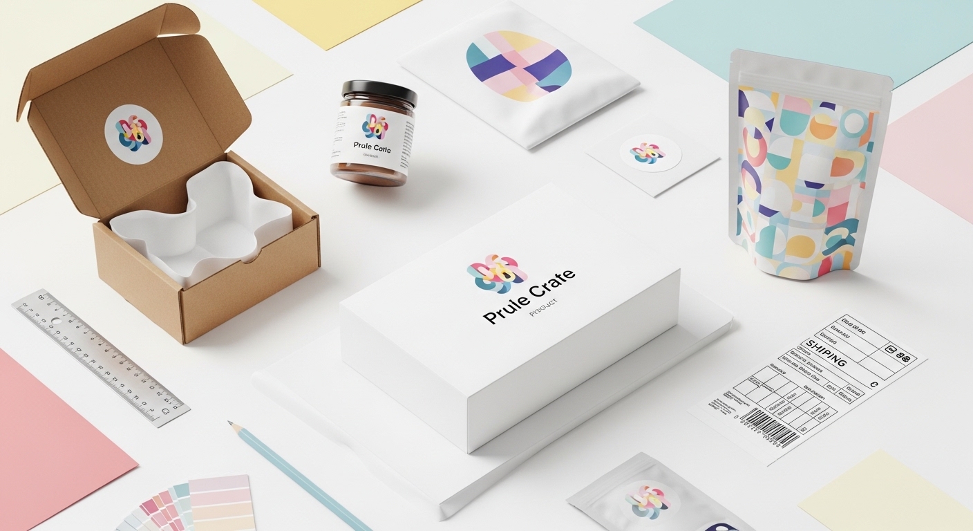
Colour Psychology in Packaging
Colour is the first thing people notice — and it triggers powerful psychological responses:
- Black — luxury, sophistication, premium (perfume, electronics, high-end fashion)
- White — clean, minimal, modern (Apple, skincare, health products)
- Green — natural, eco-friendly, organic (food, wellness, sustainability)
- Blue — trust, reliability, professionalism (corporate, tech, healthcare)
- Red — energy, urgency, appetite (food, beverages, sale items)
- Pastel tones — gentle, feminine, artisanal (cosmetics, baby products, gifts)
- Kraft/natural brown — eco-conscious, authentic, handmade (artisan, organic, sustainable)
Pro tip: Use no more than 2–3 colours. Too many colours create visual noise and dilute your brand message.
Typography That Communicates
Your font choices say as much about your brand as your logo does:
- Serif fonts (Times, Garamond) — traditional, trustworthy, established
- Sans-serif fonts (Helvetica, Futura) — modern, clean, approachable
- Script fonts — elegant, personal, artisanal (use sparingly — legibility matters)
- Bold/condensed fonts — impactful, attention-grabbing (great for product names)
Golden rule: Use a maximum of two typefaces — one for headings, one for body text. Consistency builds recognition.
The Power of White Space
Resist the urge to fill every inch of your packaging with text and graphics. White space (negative space) makes your design feel premium, improves readability, and draws the eye to what matters most — your brand name and product.
Compare a supermarket own-brand product (cluttered, busy design) with a premium brand (clean, spacious layout). The white space is what makes one feel premium.
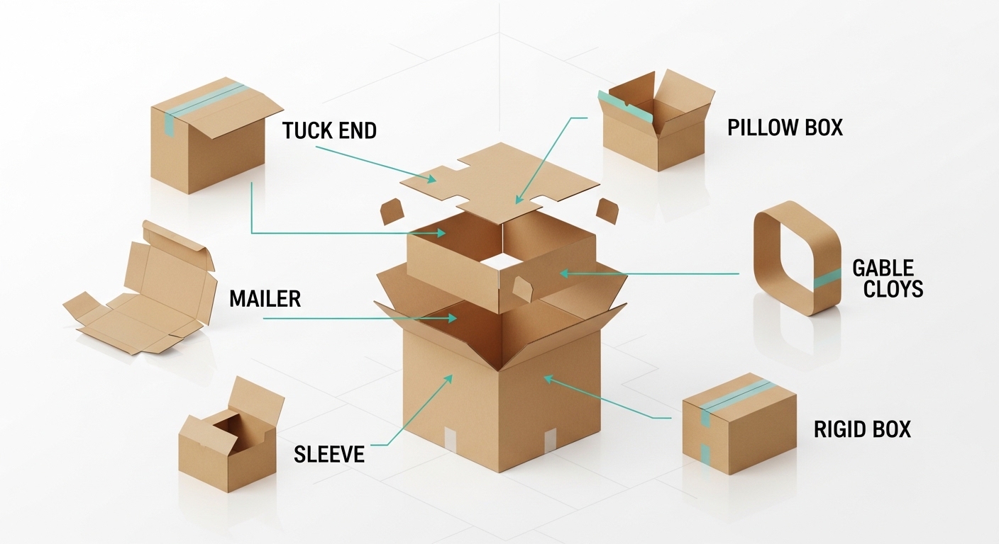
Structural Design Matters
The shape and structure of your packaging is just as important as the graphics:
- Consider the opening experience — magnetic closures, ribbon pulls, and tuck-in flaps all create different moments of discovery
- Think about shelf presence — how does your box look next to competitors?
- Design for function — does it protect the product? Is it easy to open? Can it be resealed?
- Size matters — oversized packaging feels wasteful; undersized feels cheap. Find the right balance.
Print Finishing Techniques
Finishing touches can transform a good design into a great one:
- Spot UV — a glossy raised coating applied to specific areas (logos, text) for a tactile premium effect
- Embossing/debossing — raised or recessed patterns that add texture and depth
- Foil stamping — metallic foil (gold, silver, copper) for luxury branding
- Soft-touch lamination — a velvety matte finish that feels expensive
- Die-cut windows — reveal the product inside, building curiosity and trust
Common Design Mistakes to Avoid
- Too many fonts — stick to two maximum
- Low-resolution images — always design at 300 DPI for print
- Ignoring bleed and safe zones — keep important elements 3mm inside the trim line
- Forgetting the bottom and sides — every surface is a branding opportunity
- Not testing with a physical sample — colours on screen look different in print. Always proof.
Need Design Help?
Not every business has an in-house designer — and that's fine. At QPack, we offer free design support with every order. Send us your logo and brand guidelines, and our team will create professional packaging artwork tailored to your product. Get in touch to start your project.