Put the spotlight on one detail
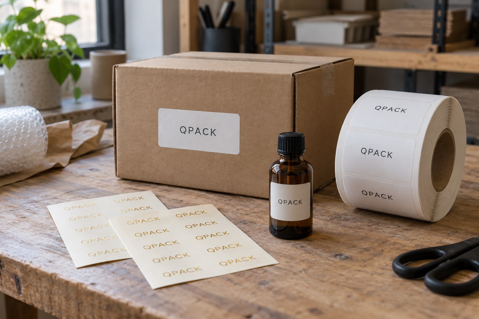
Foil works particularly well when the design gives the metallic element room to breathe. A simple emblem, a short brand name or a fine border can catch attention without making the whole label visually busy. Think about the moment the customer sees it: opening a gift, picking up a box or noticing a seal against softly folded tissue.
Choose the element that matters most and let the surrounding space support it. You might keep the logo metallic and the practical information in ordinary print, or use a small reflective symbol on an otherwise quiet label. The goal is a deliberate visual hierarchy. More foil is not automatically more effective, especially when a sticker must carry readable text as well as decoration.
Understand what “foil” means in your quote
Several production routes can create a metallic appearance. Applied foil decorates selected areas, while metallic label stock provides a reflective base that can interact with printed colours. Metallic ink is another visual treatment and should not be assumed to look identical. Photographs alone can make these differences difficult to judge.
Describe the effect you want and ask for the proposed process to be named in the quotation. If you need a bright mirror-like highlight, a softer metallic surface or a specific contrast with a matt background, say so. Process availability depends on the material, artwork and order. Keeping the desired appearance clear allows a suitable method to be assessed without promising that every metallic finish can be produced in every configuration.
Consider where the seal will sit
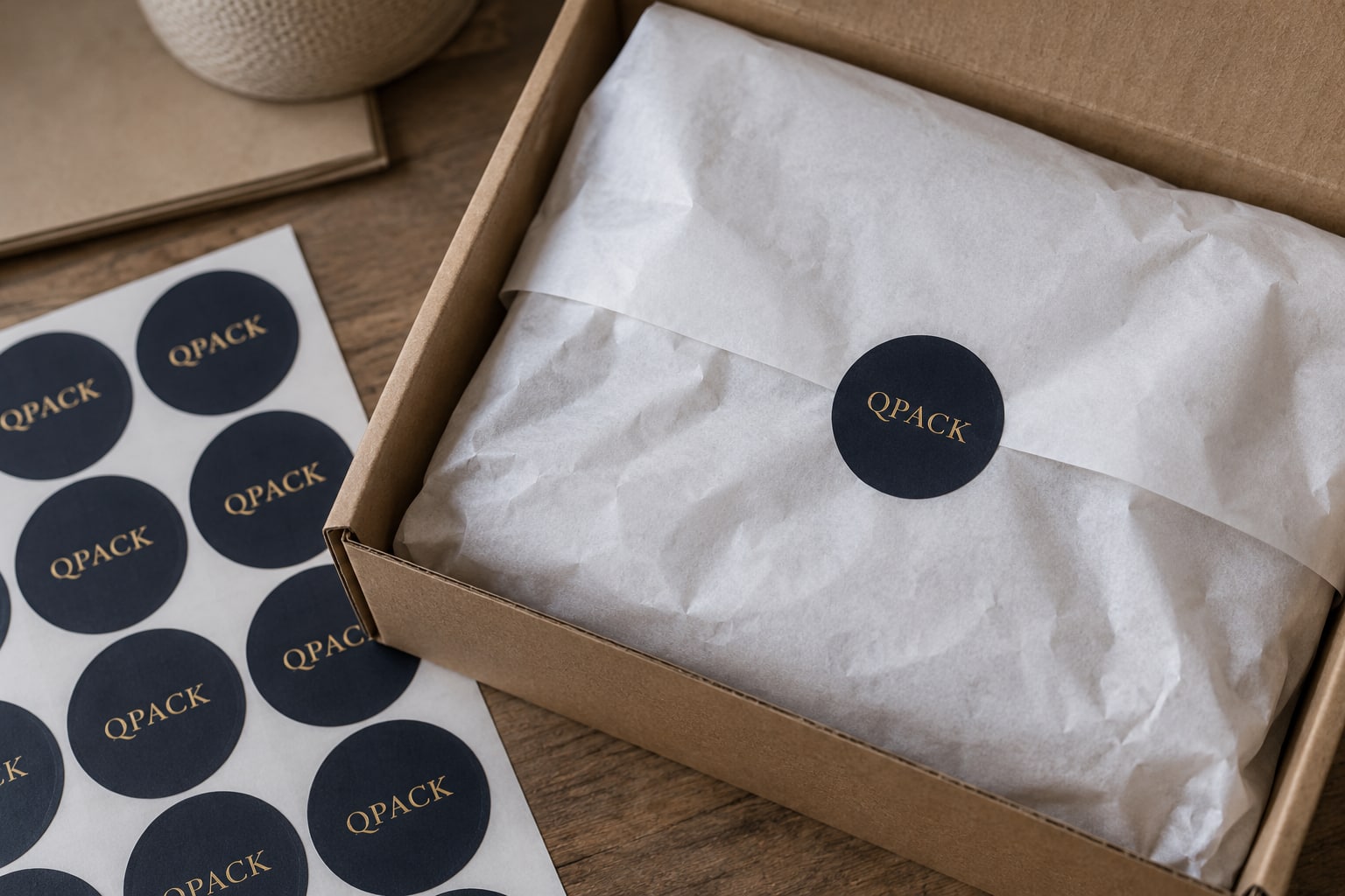
A foil sticker can create a considered finishing point on gift boxes, tissue wraps, envelopes and product packaging. Its shape should feel connected to that placement. A circle can sit naturally over a tissue overlap; a narrow rectangle might suit a box edge; an oval can complement a centred brand mark on the front of a jar.
Measure the visible area and check what happens when the packaging is opened. A decorative seal is not automatically a security seal or evidence of tampering. If controlled opening is part of the requirement, make that explicit in the brief. Likewise, a seal placed across a fold has different demands from a label on a broad flat face, so send a photograph showing the intended position.
Pair metallic colour with the right background
Gold against deep teal or charcoal can feel rich and distinctive, while silver on a pale surface can produce a cooler, quieter effect. These are design directions to explore, rather than fixed rules. The colour of the underlying stock and the amount of surrounding print both change how the metallic detail is perceived.
If the sticker needs to coordinate with a carton, ribbon or existing label, send a reference for the whole set. A screen preview cannot reproduce the way a reflective surface changes as it moves under light. Where appearance is critical, discuss a physical reference or sample before committing to the specification. This is especially useful when you are trying to match an existing metallic finish rather than choosing a new one.
Keep small lettering and linework practical
Delicate artwork can look beautiful at a large size on screen and become difficult to produce or read when reduced to a small sticker. Print a simple size mockup and review the design from the distance at which customers will see it. Watch small gaps, closely spaced letters and lines that nearly touch.
Supply clean vector artwork where possible, with the metallic areas clearly identified. The production method determines the workable detail, so let the final specification guide minimum line widths and spacing. Avoid embedding the only copy of your logo inside a low-resolution photograph. If you have several versions, identify the preferred file and explain which parts must remain unchanged. This helps the artwork discussion focus on practical adjustments rather than guesswork.
Balance decoration with product information
Foil can draw the eye to a brand, but the sticker may still need to communicate a product name, a scent, a size or other essential details. Give that information a stable, readable area with enough contrast. Reflective lettering is not always the clearest choice for very small copy, especially under changing light.
For a range of variants, keep the metallic brand element consistent and change a separate printed panel or product name. That can create a cohesive family while allowing customers and packing staff to tell versions apart. If a barcode or QR code is included, treat its scanning requirements as a separate part of the design. Decoration should support the function of the label rather than complicate it.
Choose the adhesive and format as carefully as the finish
The metallic appearance tells you little about how a sticker will bond. Include the actual surface in your enquiry: coated carton, paper wrap, glass or plastic. Mention whether the packaging is flat or curved and whether the sticker will face moisture or handling. The complete construction needs to suit those conditions.
Tell us how you plan to apply the stickers. Sheets may suit occasional gifting or multiple small batches; rolls may be worth discussing for a repeat packing routine. If a machine is involved, provide its label and roll requirements. Available formats can vary with the chosen decorative process. Agreeing these details early helps avoid selecting a beautiful finish that does not fit the practical way your business packs its products.
Plan quantities across your collection
A foil sticker can bring several packaging items together through one repeated motif. Before ordering separate sizes for every box, check whether a shared seal size could work across the range. Equally, do not force one size onto a package where it feels oversized or hides important details. A paper mockup makes these decisions easier.
List quantities by design and size, and explain whether you expect regular repeat orders or a single event. Setup and finishing choices can influence the cost structure, so there is no useful universal price without a specification. If budget is the main constraint, say which details are essential and which can change. A simpler shape or a more focused foil area may be a direction worth comparing in the quotation.
Send a brief that captures the finish
Use the quote form to share your sticker dimensions, quantity and preferred metallic colour. Add the application surface and describe the effect in plain language, such as “small gold logo on a dark label for cream tissue wrap”. Attach your artwork or a reference image if available, and distinguish inspiration from the actual design you want printed.
If the project has a gifting launch or event date, include it so timing can be checked before an order is agreed. Ask the final quotation to confirm the production route, material, finish and supply format. Proofing should include a careful review of spelling and layout, with any physical finish questions resolved separately. The result should feel intentional both in the hand and on the packaging.