Create a label that feels part of the container
A transparent label can suit a brand that wants the product to remain visible rather than cover the surface with a solid panel. It can work as a restrained logo treatment or carry a more developed layout with deliberately clear areas. The successful design starts with the container, because its colour and contents become the background.
Place your proposed artwork over a photograph of the actual pack before making the final layout decisions. Check both a full container and the way it may look after use. A design that reads well against pale contents may be much less clear against a dark product. Transparent does not mean visually absent in every condition; film edges and reflections can still be visible.
Understand clear film and white ink
Clear material describes the label base. It does not mean that ordinary printed colours will automatically appear opaque. Where colour needs a solid foundation, a white ink layer may be required beneath it. Other parts of the design can remain unprinted so that the container is visible through the sticker.
Make the intended treatment explicit in your brief. Identify areas that should be transparent, areas that should be printed in white and areas where colour should look solid. A white patch shown on a normal screen mockup can mean either white ink or empty space unless it is labelled clearly. Confirm the proposed white ink treatment with the artwork proof and ask about a physical reference when opacity is important.
Design against the real background
A transparent sticker on clear glass looks different from the same sticker on amber glass, dark plastic or a textured surface. Even the contents can change the effect. Consider the package as a complete composition: the shape, product colour, cap and label should support one another rather than compete for attention.
Keep smaller text on a background that provides dependable contrast. If the contents vary in colour, an opaque printed panel may be more useful than fully clear space behind every line. Review the artwork under ordinary lighting as well as a bright studio setup. Customers need to read the product information in realistic conditions, and a design that relies on one carefully chosen angle may not be practical.
Choose an appropriate size and shape
Measure the flat or gently curved area available on the container. Avoid assuming that the full height of a bottle is usable: shoulders, bases and changes in diameter can interrupt the label. A paper size mockup is a quick way to identify where a rectangle may wrinkle or where a smaller shape would sit more comfortably.
Consider how much clear material surrounds the artwork. A generous border may be useful for the layout, but its edge can become more noticeable on some surfaces. Very small labels can be awkward to place consistently by hand. Share the bottle or jar dimensions and a photograph if you need help judging the proportions. The finished shape should support both the appearance and the application process.
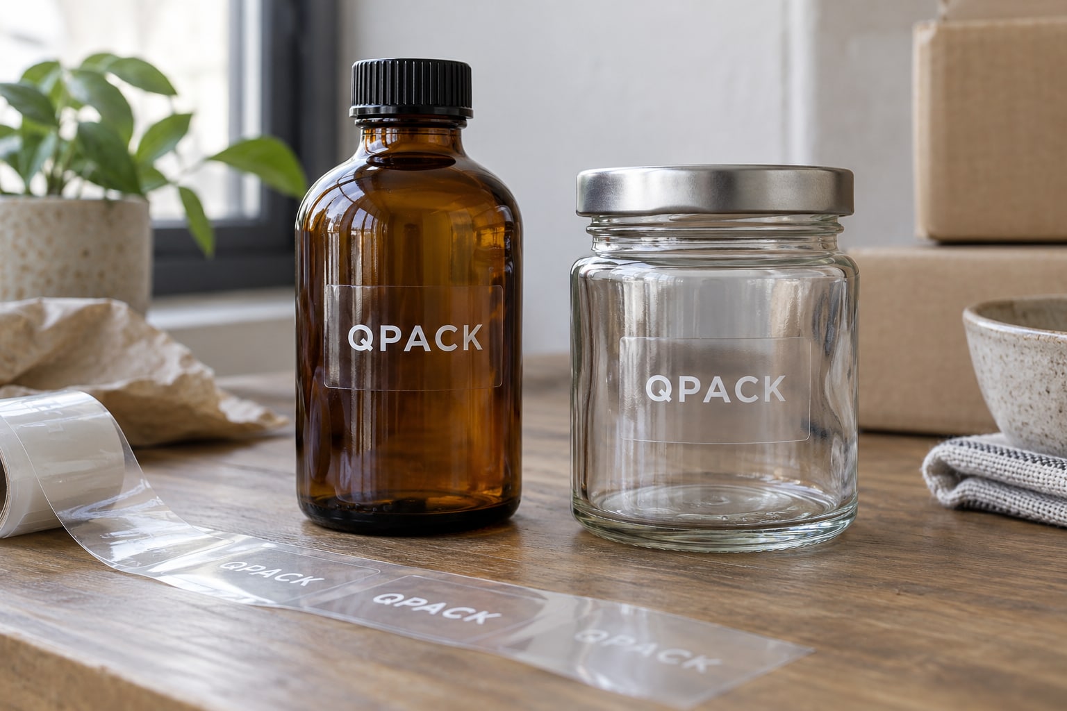
Pay attention to application quality
Transparent labels reveal the surface underneath, including trapped dust and air that might be less obvious behind an opaque paper label. A clean, dry container and a consistent application method help achieve a neater result. Preparation should follow the guidance for the chosen material and the surface being labelled.
If you plan to label many containers, test the process before the full packing run. Check how the backing releases, how easily the label can be aligned and whether the chosen shape follows the container cleanly. Machine application needs the correct roll specification, while hand application needs a practical size and orientation. A clear label is a visual choice, but the quality of the finished presentation also depends on these everyday handling details.
Specify exposure rather than assuming durability
A transparent sticker may be used on a cosmetic bottle, a gift container or another product that receives frequent handling. Each application has its own conditions. Tell us about splashes, oils, condensation, cleaning or outdoor exposure so the film, adhesive and printed finish can be checked together.
Clear appearance alone does not establish water resistance, removability or suitability for a particular temperature. Nor does a label on the outside of food packaging automatically imply approval for direct contact with food. State any special requirement in the enquiry and request confirmation for the actual construction. If the product will be used in demanding conditions, a trial with your own container and contents is more informative than a generic display sample.
Keep artwork layers easy to understand
Supply your original logo and a layout at the intended size. A vector file can help preserve clean edges and make separate colour and white ink areas easier to identify. Include a reference showing the design on the actual packaging, but keep that visual reference separate from the production artwork.
Name the clear and opaque areas explicitly. Do not flatten a mockup onto a photograph and treat that as the only file available for printing. Ask for the required production template before defining white ink layers, cut outlines or bleed. If the design includes very small reversed text, discuss its practicality. The purpose of the artwork review is to make sure that an attractive concept translates into an unambiguous printed result.
Coordinate a range without hiding the product
Transparent stickers can give a collection a shared visual language while allowing different product colours to remain visible. Keep the logo position, margins and information hierarchy consistent. Use a controlled variation, such as a printed accent or a product name, so customers can distinguish versions without the range feeling disjointed.
Check the most challenging background in the collection, not only the easiest. A colour treatment that works on one container may need a white backing on another. List quantities for each design and size, and explain whether the containers share the same material and shape. This helps identify where a single construction might work and where separate specifications need consideration. Keep approved artwork versions clearly labelled for future enquiries.
Ask for a quote with the right references
Choose transparent stickers in the form and enter your quantity and dimensions if known. Tell us whether the container is glass or plastic, clear or coloured, and flat or curved. Describe the desired ink treatment in ordinary language: for example, “white logo with clear space around it” or “solid colour text on an otherwise transparent label”.
Attach your artwork or a packaging photograph if available. Use the message field to flag moisture, oil or cleaning exposure, and mention a deadline if one applies. The quotation should confirm the film, adhesive, print treatment and supply format. A digital proof can establish the layout, while the appearance of clear material on your actual container may need a sample before the specification is settled.